Matter Neuroscience is a daily emotional fitness coach grounded in research on how positive experiences influence neurotransmitters and brain pathways.
By making emotional health trackable and actionable, the app gives users tools to better understand themselves and grow their capacity for happiness and resilience.
By making emotional health trackable and actionable, the app gives users tools to better understand themselves and grow their capacity for happiness and resilience.
All backed by fMRI brain scans and cutting edge neuroscience.
How I worked
I joined the team during the early development (pre-testflight alpha) and played a key role in shaping Matter's iOS app, brand, and social media over the span of nearly two years.
I worked extensively on breathing new life into a bare-bones MVP, while contributing to PRDs, agile methodology implementation, and crafting a delightful, educational and immersive user experience via fast iteration, deep collaboration with the engineering team and working directly with the CEO and stakeholders.
My focus expanded from pixel-precise and beautiful UI to deep QA of all features being shipped, iterating seamlessly and simplifying where necessary to make sure my designs were buildable while still bringing the user delightful experiences and education.
Some of my responsibilities
+ crafted a cutting-edge science-backed iOS app focused on brain health and longevity using fMRI brain scans.
+ achieved a 900% growth in user base by optimizing features for engagement and gamification, with 50% conversion rate on core calls-to-action
+ initiated and expanded design system, brand guidelines, social media posts for a new brand
+ owned user flows, prototypes, product spec and URDs; deep engineer collaboration for ease-of-building in SwiftUI
Skills: UX/UI — Figma — Design Systems — iOS App — Adobe Creative Suite — After Effects — Product Briefs — User Stories — Prototyping

——— The Home Tab
The hub of all user activity [AKA Today Tab]
How it started...
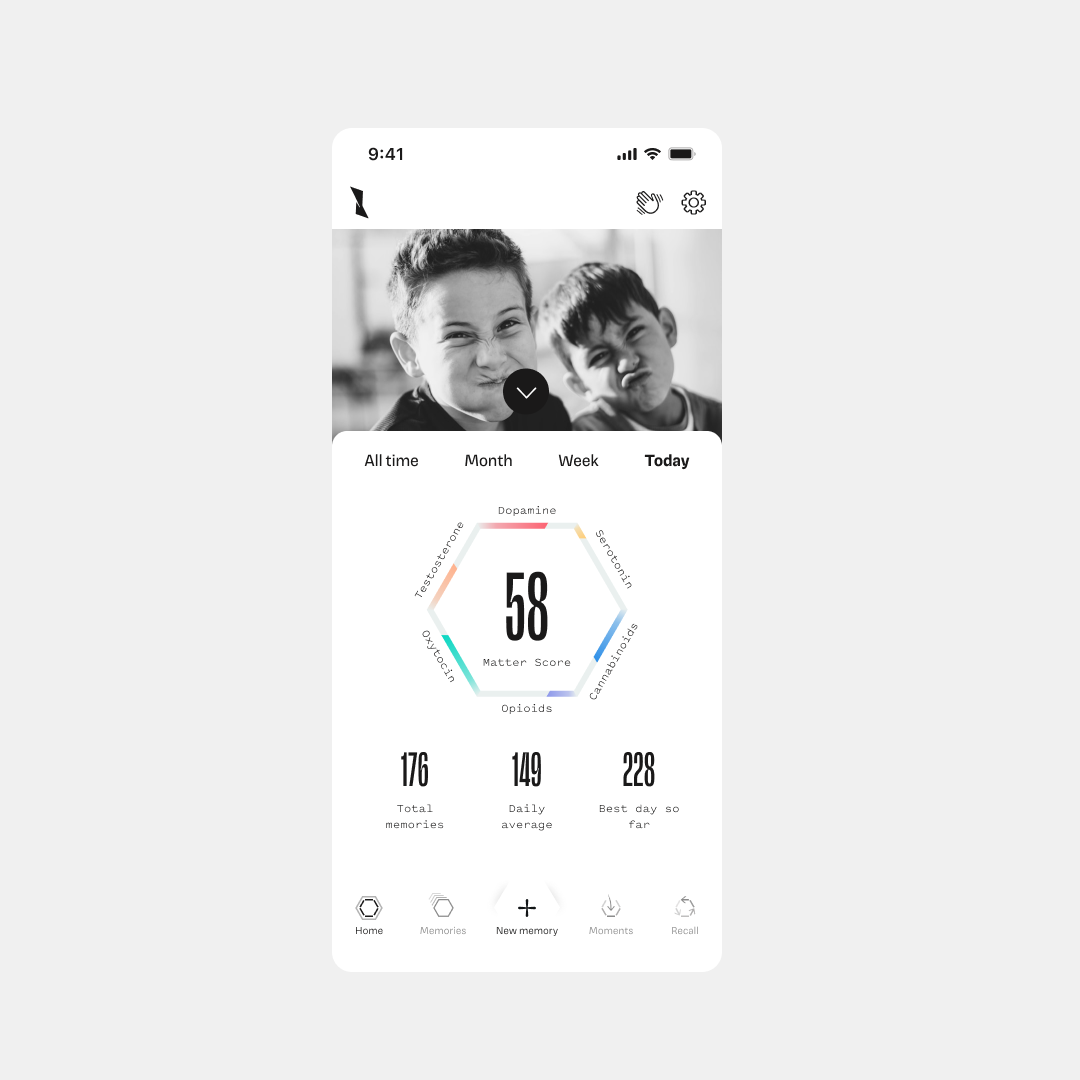
When I joined the team, the MVP of the app was extremely basic and lacked the stickiness needed to engage users. The main tab offered no actionable features, and there were no calls to action that would entice users to return.
Additionally, the metrics presented in the MVP lacked clarity, leading users to report that they were unaware certain areas were tappable, further diminishing engagement.
On the Home tab specifically, there were no actionable items and the presentation of the Matter Score and it's neurotransmitter breakdown sparked confusion in our users.
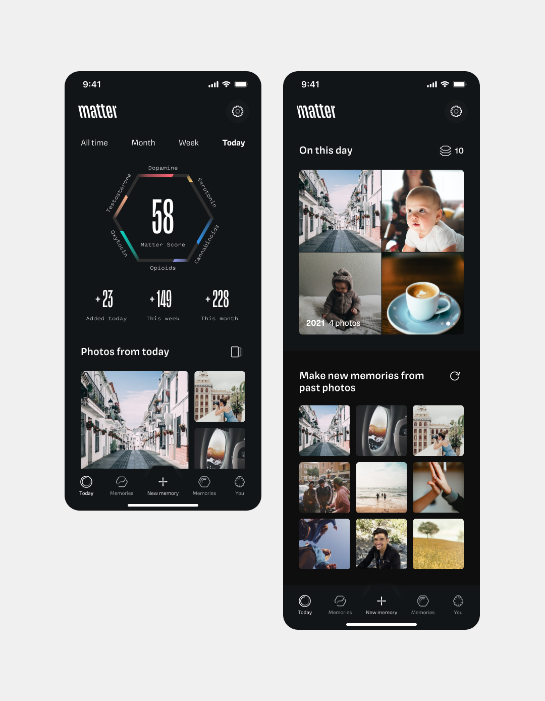
Solution #1: Photo Groups
To create a more intuitive and engaging app experience, I designed several types of photo groups aimed at encouraging users to add more memories, which in turn powered the algorithm to better understand user behavior and facilitate meaningful actions. These features included:
1. Photos From Today – This feature surfaced all photos taken today, prompting users to reflect on their day and identify any significant memories made.
2. Anniversary Photos (On This Day) – This option surfaced photos from the user's device taken on the same day in previous years. It allowed users to discover where they were 1-X years ago, encouraging nostalgic reflection and repeat visits.
3. Random Photos – Perhaps the most beloved feature, this showcased random photos from the user's photo roll, with an infinite refresh option. The clever algorithm ensured that unwanted screenshots were filtered out, making it a daily delight for users.
Impact
1. Increased engagement by 23%. Users reported a more meaningful experience, driving repeat usage and deepening their interaction with the platform. "The main reason I come back to the app"
2. Multi-entry-point memory creation facilitated growth to 80k total memories created.
——— Photo Group Wireframes & User Journey Documentation [Today Tab — Solution #1]
↓ ↓ ↓ zoom me in, drag me around, explore the my user journey, architecture, documentation and eventual hi-fi
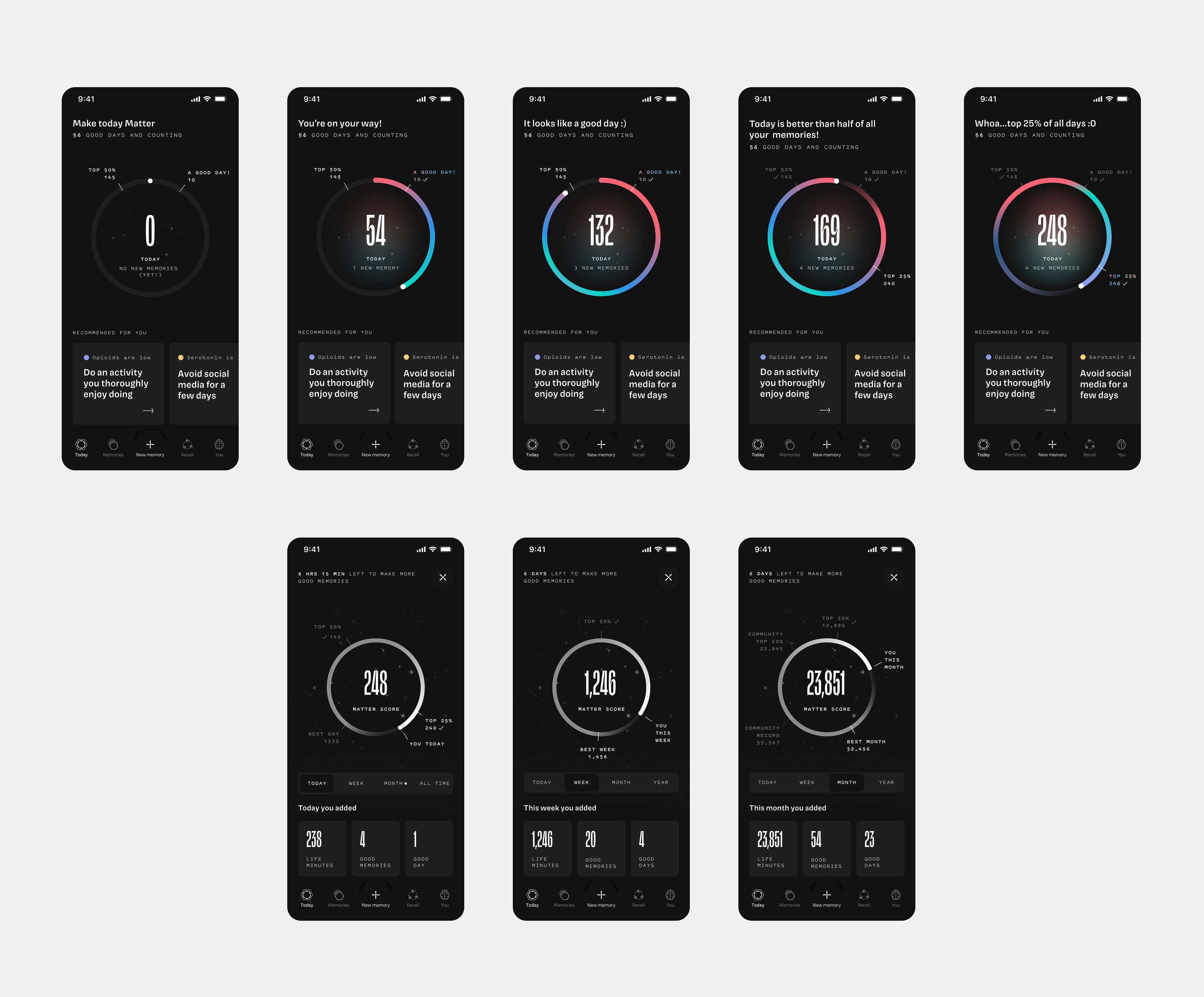
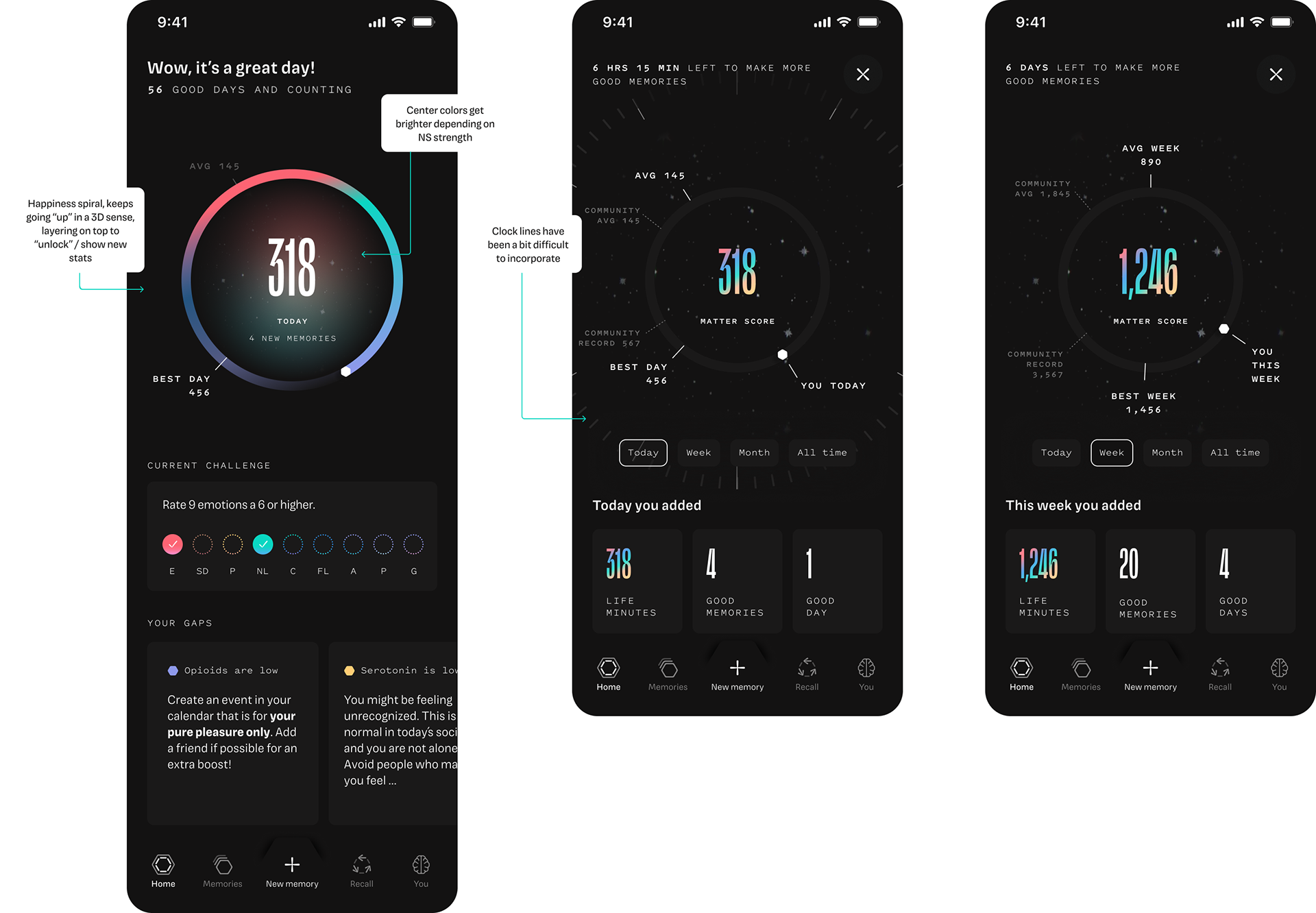
Solution #2 — Redesigned Home Tab and The Happiness Spiral
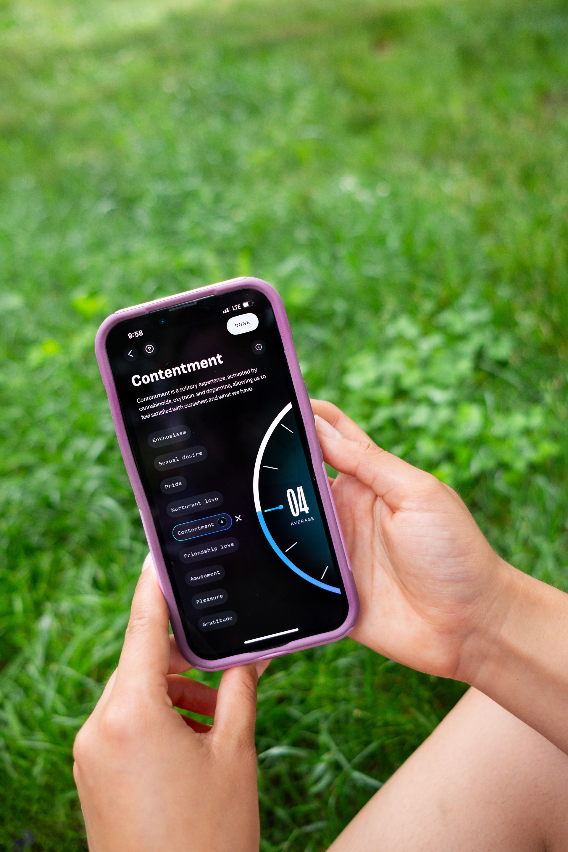
To create a more engaging and meaningful experience for users, I redesigned the home tab around a dynamic "happiness" spiral. This feature encouraged users to climb a series of personalized goal posts based on their own metrics, as well as daily calibrated community averages. The simplest goal was to achieve a Matter Score of 10 — a scientifically-backed indicator that, when viewed through an fMRI machine, signaled the user had experienced a Good Day. By reaching this score regularly, users could stay on a track of life improvement.
As users advanced, the subsequent goals became progressively more challenging, motivating them to surpass their own personal percentiles. The home tab also featured a pop of color representing the daily distribution of a user's neurotransmitter activity, providing a visual sense of how their day was going and indicating where certain neurotransmitters might be lacking.
This combination of personalized progress tracking, community comparison, and visual biofeedback created a more actionable and motivating app experience, encouraging users to return and continue working toward their well-being goals daily.
This combination of personalized progress tracking, community comparison, and visual biofeedback created a more actionable and motivating app experience, encouraging users to return and continue working toward their well-being goals daily.
Impact
1. Weekly retention increased to 30%
2. User's reported a more personalized experience with custom dynamic goals.

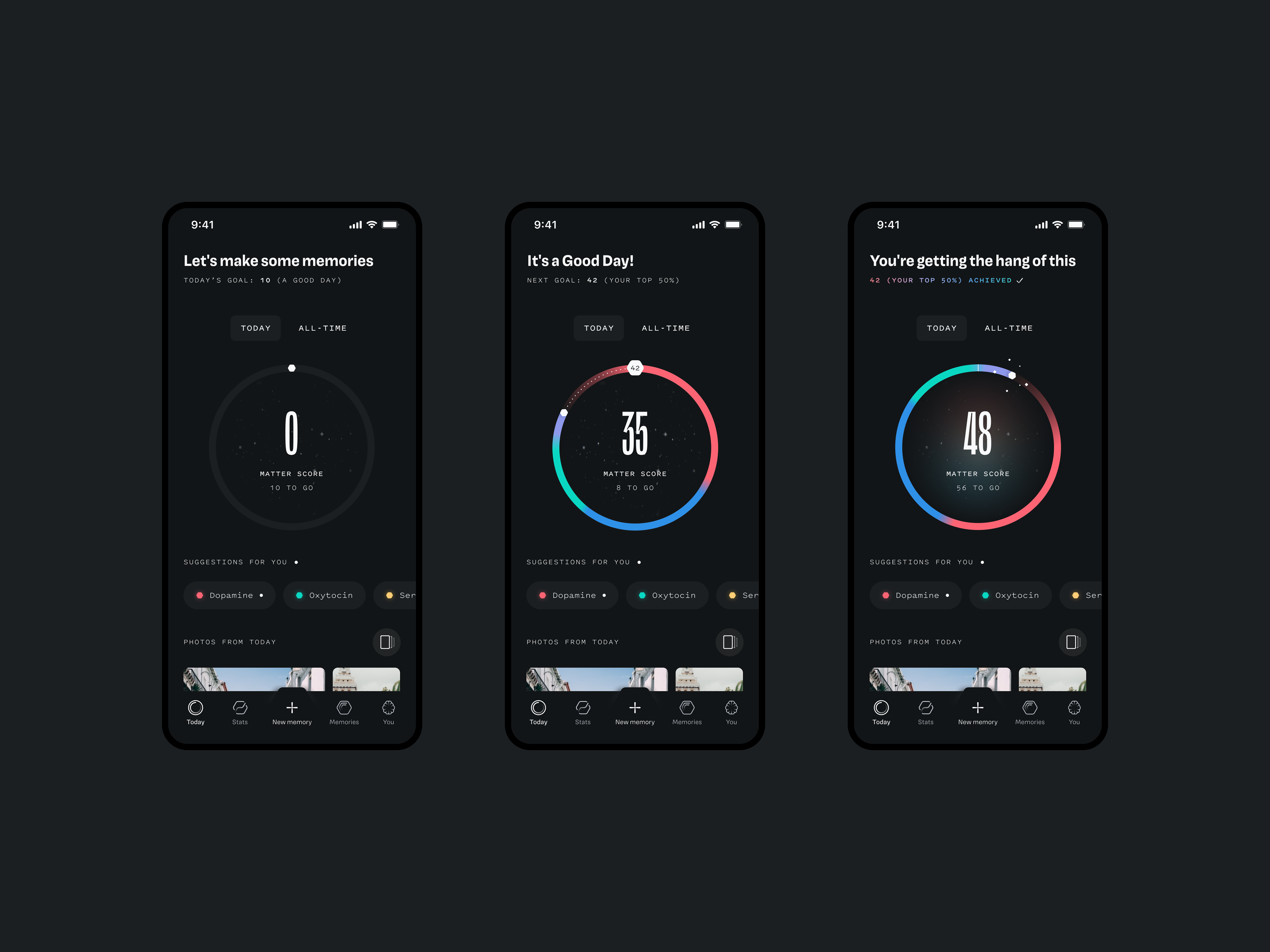
——— What We Shipped [Today Tab]
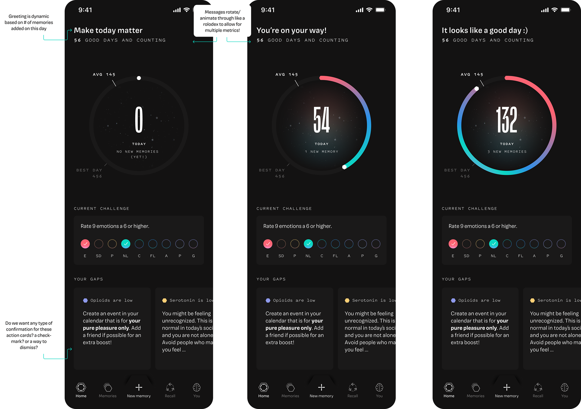
To address the engineering burden of updating community metrics daily, I streamlined the feature for its initial release. Instead of dynamic, moving targets on the first level of the happiness spiral, we opted for a simplified design—a single circumference representing the length of each goal post.
This adjustment significantly expedited the feature’s shipment, reducing complexity while maintaining the core functionality. It also enhanced the user experience, as completing a full circle each day provided a more achievable and satisfying goal, encouraging daily engagement without overwhelming the user.
This adjustment significantly expedited the feature’s shipment, reducing complexity while maintaining the core functionality. It also enhanced the user experience, as completing a full circle each day provided a more achievable and satisfying goal, encouraging daily engagement without overwhelming the user.
——— Wireframes & User Journey Documentation [Today Tab]
↓ ↓ ↓ zoom me in, drag me around, explore the my user journey, architecture, documentation and eventual hi-fi
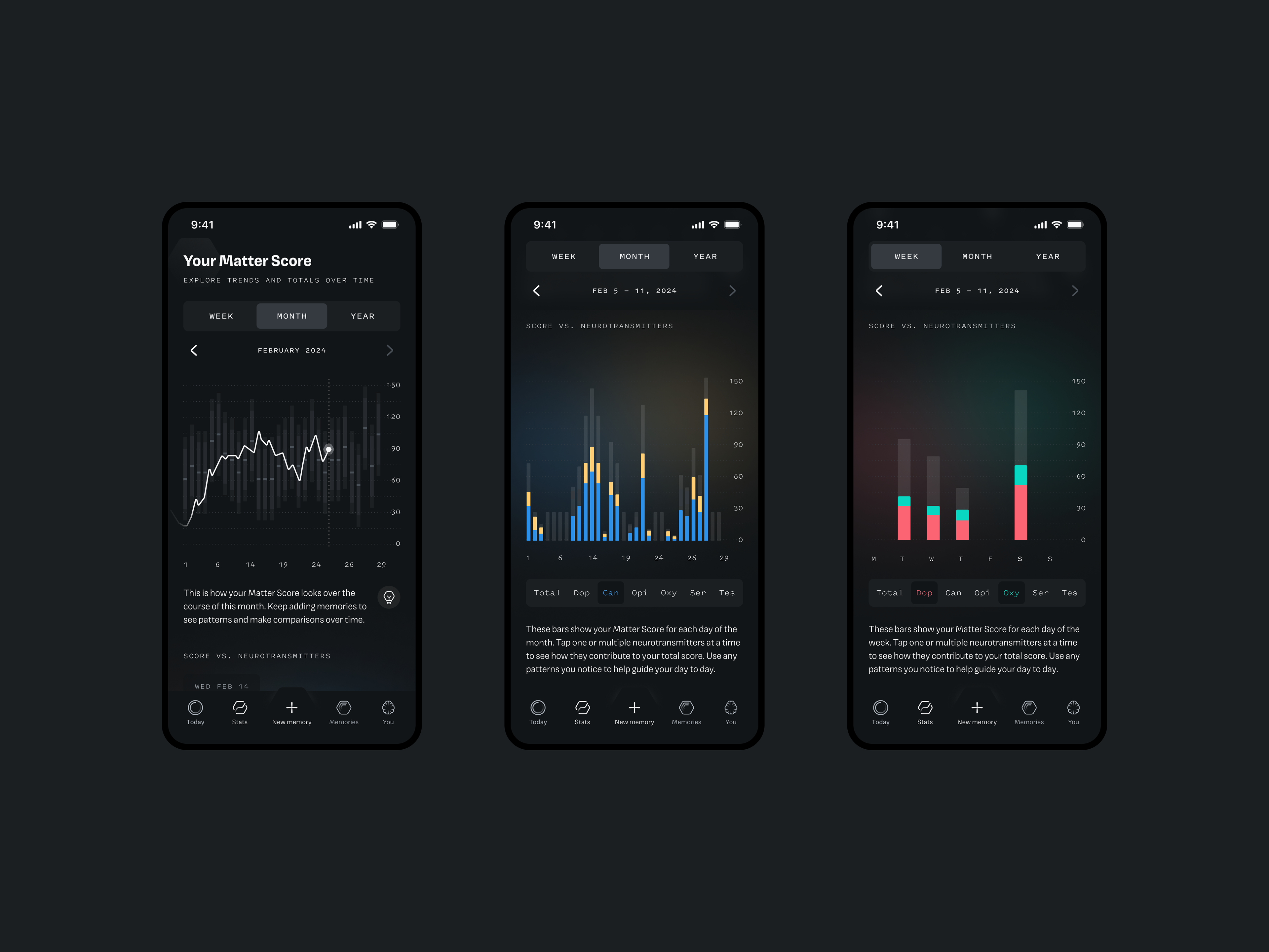
——— Statistics and User Metrics Over Time [Stats Tab]
The Challenge
The app had a rich user experience centered around helping people understand their memories and emotions, but lacked a way for users to track their progress. Without any analytics or data-driven insights, users couldn’t see how many memories they had added or how their interactions were impacting their overall Matter Score.
This absence of feedback left users disengaged and unaware of their growth within the app, creating a missed opportunity to reinforce positive behavior and user retention.
This absence of feedback left users disengaged and unaware of their growth within the app, creating a missed opportunity to reinforce positive behavior and user retention.
The Solution
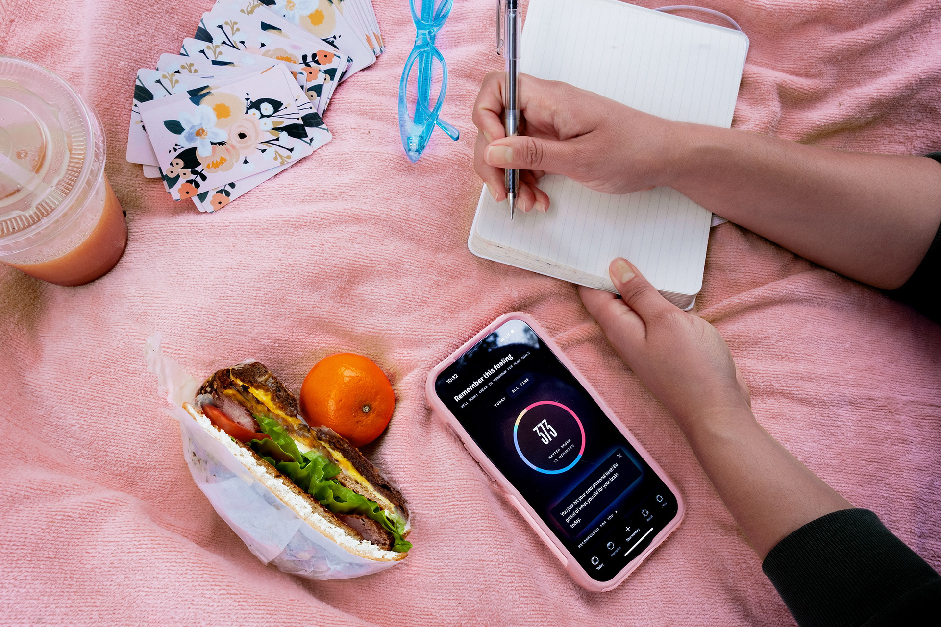
I introduced a metric-tracking tab that gave users a visual representation of their activity within the app, drawing inspiration from well-tested tracking features, but with a unique twist—a deeper dive into neurotransmitter breakdowns and how they impacted the total Matter Score over time.
This gave users a more comprehensive understanding of their emotional and mental health by allowing them to visualize how their activities affected key neurotransmitters.
The tab also encouraged users to maintain streaks, identify gaps in their neurotransmitter activity, and track their overall progress by visualizing how many "Matter Minutes" they added to their life. By combining these elements, we created a feature that not only engaged users but also helped them track their well-being in a way that was both data-driven and meaningful.

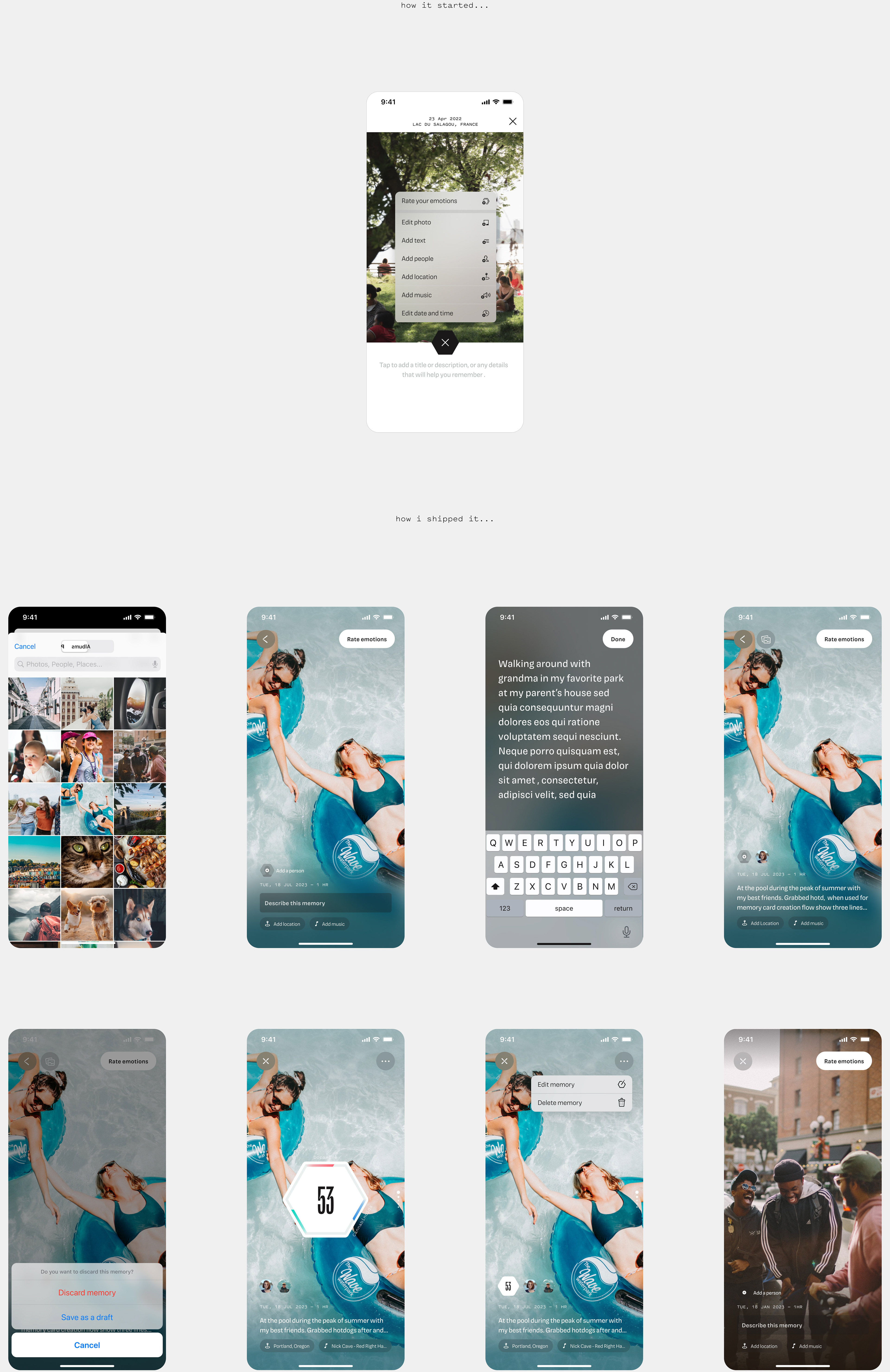
——— Memory Card & Memory Feed [Main App CTA & Feature]
The Challenge
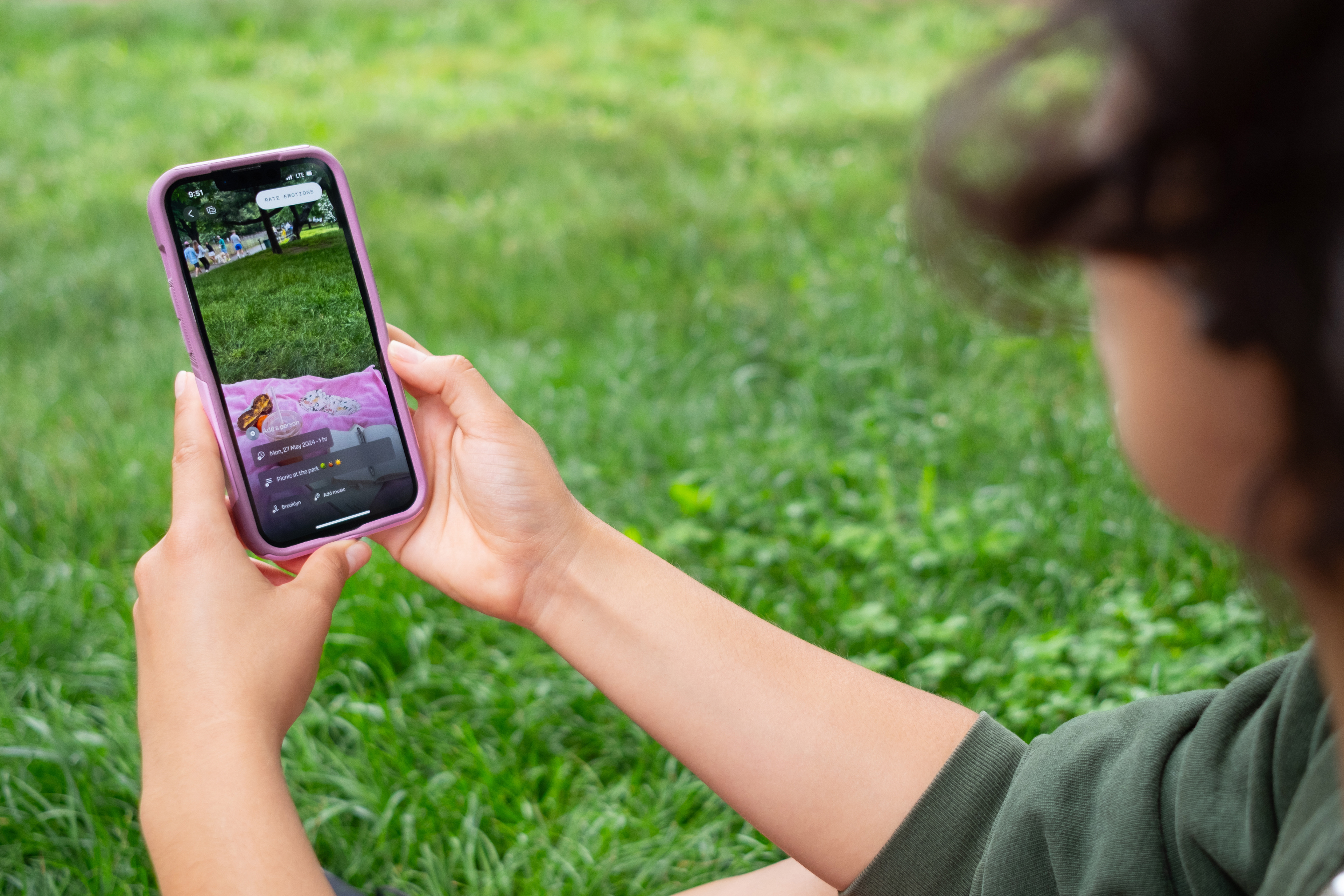
This is arguably the most important feature and sequence of the app, we need a user to easily add photo (and in the future, text) memories, rate their emotions, and continue building their Memory Vault. The MVP functionality was a very basic, static memory card, with disruptive UI patterns that complicated the purpose of cataloging and reliving the memory.
The Solution
A deeply immersive in-situ creation and editing flow where the user can do everything (namely adding their anchors: people, places and music that contribute to the strength of the memory) in a single place without needing to leave the view. One of our biggest scientific goals was to maintain the users attention of the photo, which served as the neurological trigger; thus I aimed to have the image take up as much real-estate as possible with non-disruptive call to actions for anchor additions.
——— Memory Card & Memory Feed Wireframes & User Flows [Main App CTA & Feature]
↓ ↓ ↓ zoom me in, drag me around, explore the my user journey, architecture, documentation and eventual hi-fi